Brand Identity for Khan by NUR
Brand Identity for Khan by NUR
Brand Identity for Khan by NUR
Brand Identity for Khan by NUR
Brand Identity for Khan by NUR
Brand Identity for Khan by NUR
Brand Identity for Khan by NUR
Brand Identity for Khan by NUR
Brand Identity for Khan by NUR
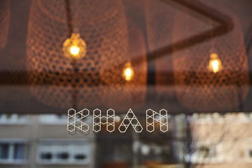
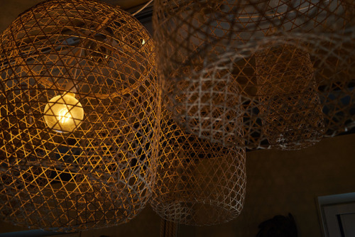
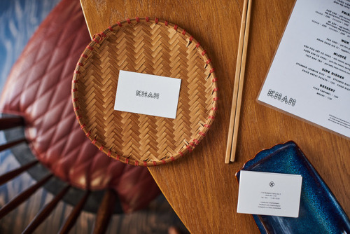
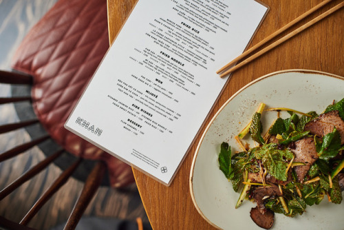
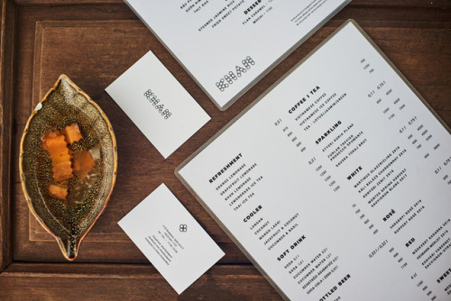
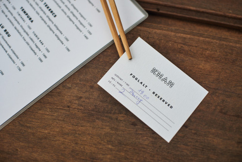
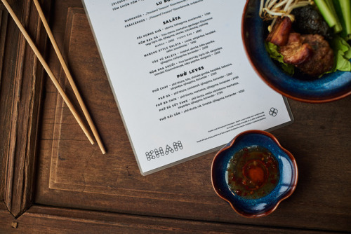
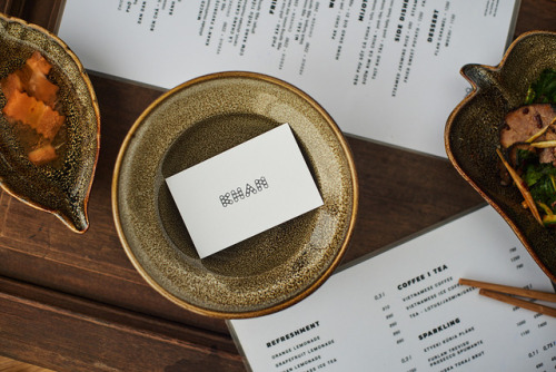
“Khan means majestic which applies to the food service as much as to the interior design. Given that the menu contains eye-catching courses in a fabulous environment we tried to keep the graphic identity as simple as possible and let the food prevail. The logo is derived from the lattice pattern of the woven lampshades which are typical Asian products originally used as fish nets.”
Studio NUR is a Budapest-based graphic design studio founded by Eszter Laki. They use clean typography and hand-drawn details. They love brainstorming on the full concepts from the scratch – managing the whole process from the first sketch to the photo documentation. They work with passion and commitment and appreciate the same enthusiasm on the client’s part too. Their international assignments range from product identity through editorial design to clients from the hospitality industry.
T D B: instagram • twitter • facebook • newsletter • pinterest
from The Design Blog https://ift.tt/2Oxhd5i
No comments:
Post a Comment